TextEffects Ever see any of those cool Text logo's and wonder how they do that? Wondero no more. Here are some quick and simple exercises that are fun and will get you on the path to creating a few neat effects of your own. These are Designed around people that have Photoshop 5.0 So if you don't have it, this might be pretty useless.
Adding PerspectiveNow this is fun, and simple,and this technique can be used with alot more then just text,you can do this to add depth to your backgrounds, create cooleffects, and have fun with of course ;)
 Instead of selecting the entire image, this time we are goingto make a box around the Text your using with the Rectangle selector.Then Edit>Tansform>Perspective. this will put littleboxes on each of the corners. Now, what you want to do is clickand hold on one of the upper corners and pull it into the picture.Then grab one of the lower corners and pull it out away from thepicture. That will make the Text on the top smaller, and the texton the bottom larger. Making it look like the Text is coming towardsyou. Click anywhere on the tool bar to the left and click applyis you like your results.
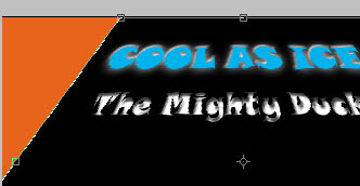
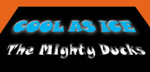 Hereis an example of how it will look on both sides. This is actuallya pretty extreme change, because the Cool as Ice text was twicethe size as the White text! We'll work on making one thats moredynamic on the next page. (Tip: Transfrom> Distort and Sceware also very helpful if your going to be playing around withthings, and if your whole image is selected, Rotate will let youspin and place your text anywhere you want it.)
Make your Very Own Mighty DuckLogo!